이 글은 Android AlertDialog 를 style.xml 로 얼마나 어디까지 변경시킬 수 있는가를 알아볼 수 있는 글입니다.
코드는 여기를 참고하시면 됩니다.
androidx.appcompat:appcompat:1.1.0 을 사용했습니다.
// :app/build.gradle

dependencies {
...
    implementation 'androidx.appcompat:appcompat:1.1.0'
...
}
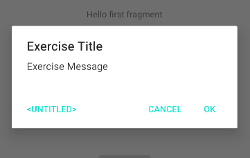
Android Studio 를 열고, 새로운 프로젝트 템플릿으로 간단한 안드로이드 앱 프로젝트를 만든 뒤, 아래와 같은 코드를 MainActivity 에 추가합니다. 그리고, 앱을 실행하면, 그림과 같은 화면이 보여질 것입니다. (다이얼로그의 스트링은 Android Resource 를 사용했습니다. string.xml 파일에 추가하기가 매우 귀찮아서요. --;)
    fun showDialog(){
        AlertDialog.Builder(this)
            .setTitle("Exercise Title")
            .setMessage("Exercise Message")
            .setPositiveButton(android.R.string.yes, null)
            .setNegativeButton(android.R.string.no, null)
            .setNeutralButton(android.R.string.untitled, null)
            .show()
    }

템플릿에서 생성해주는 코드에는 application theme 로 AppTheme 를 activity theme 로는 AppTheme.NoActionBar 를 자동으로 설정해줍니다.
<!-- AndroidManifest.xml -->
    <application
	...
        android:theme="@style/AppTheme">
        <activity
            android:name=".MainActivity"
            android:label="Main"
            android:theme="@style/AppTheme.NoActionBar">
            <intent-filter>
                <action android:name="android.intent.action.MAIN" />
                <category android:name="android.intent.category.LAUNCHER" />
            </intent-filter>
        </activity>
        <activity android:name=".NextActivity" android:label="Next"/>
    </application>
<!-- src/main/res/values/style.xml -->
<style name="AppTheme" parent="Theme.AppCompat.Light.DarkActionBar">
<!-- Customize your theme here. -->
<item name="colorPrimary">@color/colorPrimary</item>
<item name="colorPrimaryDark">@color/colorPrimaryDark</item>
<item name="colorAccent">@color/colorAccent</item>
</style>
<style name="AppTheme.NoActionBar">
<item name="windowActionBar">false</item>
<item name="windowNoTitle">true</item>
</style>
<!-- src/main/res/values/color.xml -->
<color name="colorPrimary">#6200EE</color>
<color name="colorPrimaryDark">#3700B3</color>
<color name="colorAccent">#03DAC5</color>
기본으로 생성해주는 코드를 실행했을 때의 AlertDialog 의 모습은 아래와 같습니다. OK, Cancel 버튼의 색깔이 AppTheme 에서 설정한 colorAccent 의 값(#03DAC5)입니다.
간단하게 버튼의 색깔을 바꾸는 것은 colorAccent 값을 바꿔 주는 것만으로도 가능합니다. 이를 테면, 아래 코드처럼 activity theme 인 AppTheme.NoActionBar 에 colorAccent 아이템을 추가해주는 것 만으로도 쉽게 변경할 수 있습니다.
<!-- src/main/res/values/style.xml -->
    <style name="AppTheme.NoActionBar">
		...
        <item name="colorAccent">@android:color/holo_green_dark</item>
    </style>
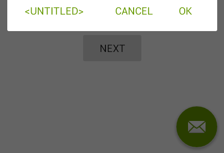
하지만, 이런 식으로 변경하면, 그림 우 하단의 편지 모양의 색깔도 같이 바뀌어 버립니다.
만약, 이런 색상 변경이 의도된 것이라면 상관없지만, alertDialog 의 색상만 바꾸고자한다면, alertDialogTheme 스타일을 만들어서 별도로 설정해야 합니다.
    <style name="AppTheme.NoActionBar">
        <!--        <item name="colorAccent">@android:color/holo_green_dark</item>-->
        <item name="alertDialogTheme">@style/AppTheme.AlertDialogTheme</item>
    </style>

    <style name="AppTheme.AlertDialogTheme" parent="ThemeOverlay.AppCompat.Dialog.Alert">
        <item name="colorAccent">@android:color/holo_green_dark</item>
    </style>
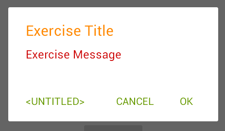
다이얼로그 테마에 android:textColorPrimary 아이템을 추가해주면, 다이얼로그 타이틀의 색상을 변경할 수 있습니다.
    <style name="AppTheme.AlertDialogTheme" parent="ThemeOverlay.AppCompat.Dialog.Alert">
        <item name="colorAccent">@android:color/holo_green_dark</item>
        <item name="android:textColorPrimary">@android:color/holo_red_dark</item>
    </style>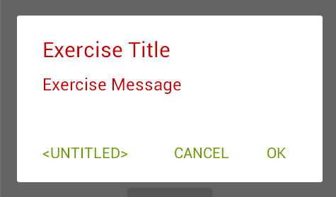
음... 메시지 색상까지 같이 변경되었습니다. --; 타이틀과 메시지를 각각 다른 색으로 지정하려면, 역시 스타일을 지정해주어야 합니다. 타이틀 스타일은 android:windowTitleStyle 을 사용합니다.
    <style name="AppTheme.AlertDialogTheme" parent="ThemeOverlay.AppCompat.Dialog.Alert">
        <item name="colorAccent">@android:color/holo_green_dark</item>
        <item name="android:textColorPrimary">@android:color/holo_red_dark</item>
        <item name="android:windowTitleStyle">@style/AppTheme.AlertDialogTheme.WindowTitle</item>
    </style>

    <style name="AppTheme.AlertDialogTheme.WindowTitle" parent="RtlOverlay.DialogWindowTitle.AppCompat">
        <item name="android:textColor">@android:color/holo_orange_dark</item>
    </style>
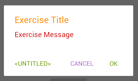
마지막으로 Cancel 만 한 번 바꾸어 보도록 하겠습니다. buttonBarButtonStyle 을 추가하면 되는데, 그러면, 모두 바뀌어 버리니, buttonBarNegativeButtonStyle 스타일만 하나 추가해 봅니다.
    <style name="AppTheme.AlertDialogTheme" parent="ThemeOverlay.AppCompat.Dialog.Alert">
        <item name="colorAccent">@android:color/holo_green_dark</item>
        ...
        <!--        <item name="buttonBarButtonStyle">@style/AppTheme.AlertDialogTheme.Button</item>-->
        <!--        <item name="buttonBarPositiveButtonStyle">@style/AppTheme.AlertDialogTheme.Button</item>-->
        <item name="buttonBarNegativeButtonStyle">@style/AppTheme.AlertDialogTheme.Button</item>
        <!--        <item name="buttonBarNeutralButtonStyle">@style/AppTheme.AlertDialogTheme.Button</item>-->
    </style>

    <style name="AppTheme.AlertDialogTheme.Button" parent="Widget.AppCompat.Button.ButtonBar.AlertDialog">
        <item name="android:textColor">@android:color/holo_purple</item>
    </style>
위에서 말한 모든 값들의 참조가 될 수 있는 것들의 힌트는 appcompat-1.1.0/res/values/values.xml 에 모두 있습니다. 알고보면, abc_alert_dialog_material.xml 레이아웃의 DialogTitle 과 message TextView 의 textColor 는 동일하게 ?android:textColorPrimary 로 설정되어 있다는 것도 확인할 수 있습니다.
<!-- appcompat-1.1.0/res/values/values.xml -->
<style name="Theme.AppCompat.Light.DarkActionBar" parent="Base.Theme.AppCompat.Light.DarkActionBar"/>

<style name="Base.Theme.AppCompat.Light.DarkActionBar" parent="Base.Theme.AppCompat.Light">

<style name="Base.Theme.AppCompat.Light" parent="Base.V7.Theme.AppCompat.Light">

<style name="Base.V7.Theme.AppCompat.Light" parent="Platform.AppCompat.Light">
	...
        <item name="alertDialogTheme">@style/ThemeOverlay.AppCompat.Dialog.Alert</item>
        <item name="alertDialogStyle">@style/AlertDialog.AppCompat.Light</item>
        <item name="alertDialogCenterButtons">false</item>
        <item name="textColorAlertDialogListItem">@color/abc_primary_text_material_light</item>
        <item name="listDividerAlertDialog">@null</item>
	...
</style>

<style name="AlertDialog.AppCompat.Light" parent="Base.AlertDialog.AppCompat.Light"/>

<style name="Base.AlertDialog.AppCompat.Light" parent="Base.AlertDialog.AppCompat"/>

<style name="Base.AlertDialog.AppCompat" parent="android:Widget">
  <item name="android:layout">@layout/abc_alert_dialog_material</item>
  <item name="listLayout">@layout/abc_select_dialog_material</item>
  <item name="listItemLayout">@layout/select_dialog_item_material</item>
  <item name="multiChoiceItemLayout">@layout/select_dialog_multichoice_material</item>
  <item name="singleChoiceItemLayout">@layout/select_dialog_singlechoice_material</item>
  <item name="buttonIconDimen">@dimen/abc_alert_dialog_button_dimen</item>
</style>
덧붙임.
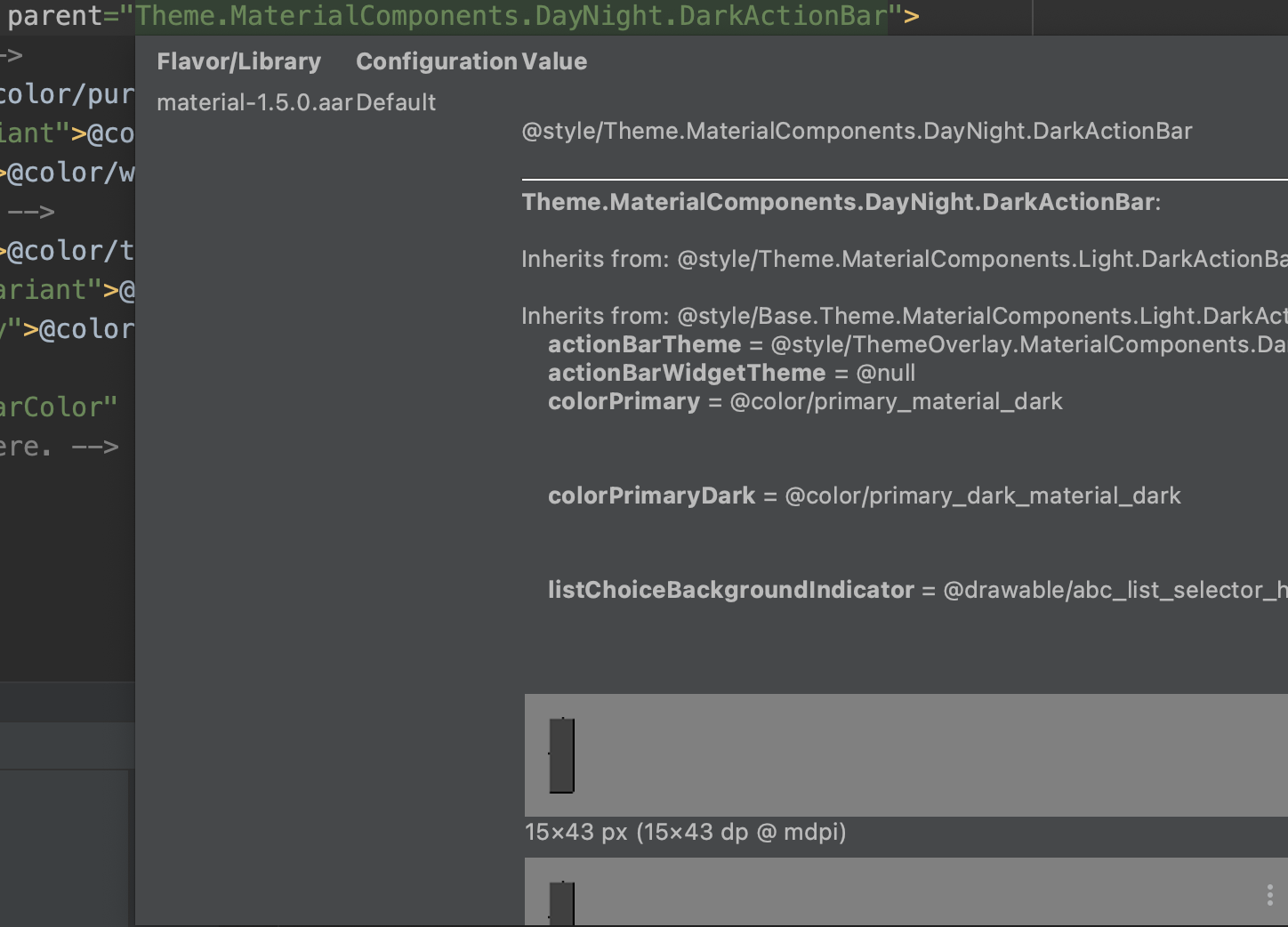
Android Studio 에서 theme.xml 파일에서 마우스 오버만 해도 관련된 정보들을 상당수 확인할 수 있습니다.
'Android' 카테고리의 다른 글
| Android targetSdkVersion=30, queryIntentActivities() 문제 (0) | 2022.01.10 |
|---|---|
| Gson - Android Proguard 문제 (0) | 2020.11.12 |
| Android Studio - Database Inspector (0) | 2020.11.04 |
| Android Custom Lint (0) | 2020.07.28 |
| Android useClearTextTraffic, isClearTextTrafficPermitted (0) | 2020.07.15 |
