전체 글 (24)

Gson 은 JSONObject 를 파싱해서 객체로 만들어 사용할 때, 파싱하는 번거로움을 줄여주는 유용한 라이브러리입니다.


Gson 은 상당히 오래전 부터 사용해오던 라이브러리입니다.

개발을 하면서 처음 Gson 이란 놈을 만났던 것은 2010년대 초반 정도였던 것으로 기억하는데,

Github 의 정보를 보니 1.0 이 릴리즈 된것이 2008년이니 최소한 10년은 넘은 라이브러리입니다.


github.com/google/gson


google/gson

A Java serialization/deserialization library to convert Java Objects into JSON and back - google/gson

github.com


Gson 과 관련된 글들이 많이 있지만, 간단한 코드를 보는 것이 가장 유용합니다.

아래 코드를 보면, Person 이라는 객체의 멤버 이름을 JSONObject 의 Key 값으로  치환해서 String 으로 변환해 줍니다.

거꾸로 이 String 을 JSONObject 로 변환할 수 있다면, 다시, 이전의 Person 이라는 객체로 만들어 줄 수도 있습니다.


fun main(args: Array<String>) {
    val p1 = Person("John", 10)
    val json: String = GsonBuilder().create().toJson(p1)
    println(json)

    val p2: Person = GsonBuilder().create().fromJson<Person>(json, Person::class.java)
    println("name=${p2.name}, age=${p2.age}")
}

class Person(val name: String, val age: Int)

//----- Result -----
{"name":"John","age":10}
name=John, age=10


어떻게 이렇게 만들 수 있을까? 가 궁금해 집니다.

라이브러리 내부의 코드들은 더 복잡하고 많은 내용들을 담고 있지만, 간단하게 그 원리를 파악해보기 위해, 아래와 같은 코드를 실행해 보면, 어느 정도 짐작해 볼 수 있습니다.

코드에서는 클래스 내부에 선언된 필드들의 이름과 타입을 파악할 수 있는데, 이를 이용하면, 라이브러리를 사용하는 사람이 어떤 종류의 객체, 클래스를 생성하건 이를 이용해서 JSONObject 로 변환해 줄 수 있는 코드를 만들 수 있습니다.

- 물론, 아래와 같이 간단한 객체의 경우는 저 정도의 코드 만으로도 변환이 가능하겠지만, 실제 라이브러리의 코드를 참조하면, 더 많은 내용들이 담겨져 있고, 한 편으로는 더 많은 공부가 필요 하기도 합니다.


fun main(args: Array<String>) {
    val c : Class<*> = Person::class.java
    for(d in c.declaredFields){
        println("Field Name = ${d.name}, Type = ${d.type}")
    }
}

class Person(val name: String, val age: Int)

// ---- Result ----
Field Name = name, Type = class java.lang.String
Field Name = age, Type = int


이 글을 쓰게 된 것은 제목에서도 보이지만, 단순히 Gson 에 대해 소개하거나 설명하기 위한 글이 아닙니다.

Gson 이 Android 와 만났을 때, 그리고, Android 에서 난독화되었을 때의 문제를 풀어내기 위해서 입니다.

Android 의 proguard 는 클래스 필드명을 모조리 바꾸어 버립니다.

이를 테면, 위의 코드에서 사용했던 Person 같은 객체의 이름과 필드의 이름들은 아래와 같이 변경됩니다.


class A(val a: String, val b: Int)
// class Person(val name: String, val age: Int)


즉, 이런 식으로 바뀌면, 처음 {"name":"John","age":10} 으로 출력되었던 결과물은 {"a":"John","b":10} 으로 출력될 것입니다.

거꾸로 JSONOjbect 스트링을 객체로 변환하는 것은 당연히 실패합니다.

여기서 약간 난해한 상황은 기본 값을 갖는 객체가 생성되지 Error를 발생시킨다던가 하지 않습니다.

그래서, build variant 를 debug 로 실행할 때는 문제가 없었지만, release 로 실행할 때는 전혀 예상할 수 없는 결과가 나오게 되면 매우 당황하게 됩니다.


물론, github/gson android 예제로 부터 간단히 답을 찾을 수 있습니다.

(github.com/google/gson/blob/master/examples/android-proguard-example/proguard.cfg) 파일을 참조하면, 다음과 같습니다.


##---------------Begin: proguard configuration for Gson  ----------
# Gson uses generic type information stored in a class file when working with fields. Proguard
# removes such information by default, so configure it to keep all of it.
-keepattributes Signature

# For using GSON @Expose annotation
-keepattributes *Annotation*

# Gson specific classes
-dontwarn sun.misc.**
#-keep class com.google.gson.stream.** { *; }

# Application classes that will be serialized/deserialized over Gson
-keep class com.google.gson.examples.android.model.** { <fields>; }

# Prevent proguard from stripping interface information from TypeAdapter, TypeAdapterFactory,
# JsonSerializer, JsonDeserializer instances (so they can be used in @JsonAdapter)
-keep class * extends com.google.gson.TypeAdapter
-keep class * implements com.google.gson.TypeAdapterFactory
-keep class * implements com.google.gson.JsonSerializer
-keep class * implements com.google.gson.JsonDeserializer

# Prevent R8 from leaving Data object members always null
-keepclassmembers,allowobfuscation class * {
  @com.google.gson.annotations.SerializedName <fields>;
}

##---------------End: proguard configuration for Gson  ----------


Android Library Project 로 consumer-proguard 를 추가했더라면, 상황이 달라질 수 있겠지만, Gson jar 파일로만 배포합니다.

어쨋거나, 위의 예제 프로젝트를 참고하여, proguard 파일에 똑같이 추가해주어야 별문제가 없을 것 같습니다.

그럼에도 여기서 가장 중요한 것은 아래 라인입니다.

저 부분에 Person 에 해당하는 class 파일(즉, 직접 추가한 클래스)을 넣어 주어야 합니다.

그래야, 위에서 얘기한 것처럼 난독화 할 때, name -> a 로 바뀌는 문제를 방지할 수 있습니다.


-keep class com.google.gson.examples.android.model.** { <fields>; }
# -keep class com.example.Person { <fields>; }


와우 드디어 안드로이드 스튜디오에 DB inspector 가 들어왔습니다.

해당 기능은 Android 스튜디오 4.1 Canary 6 이상(이 글을 쓰는 시점보다 약 6개월 정도 전?) 에서 확인할 수 있습니다.

4.1 업데이트 이후 inspector 를 기본 탭에 추가시켜줬기에 알아차렸지 그렇지 않았더라면 알지도 못했을 것 같습니다.(developer.android.com/studio/preview/features?hl=ko#database-inspector)


앱을 개발하면서, DB 에 어떤 내용이 들어가 있는지 확인하는 것은 매우 귀찮고 까다로운 일이었습니다.

왜냐하면, 지금까지는 adb 를 통해, db 파일을 내려받은 뒤, 그 파일을 다시 SQLite Browser 같은 application 을 사용해서 일일이 확인해야 했기 때문입니다.

게다가 Room Database 를 사용하는 경우, 보통 비동기로 동작하기 때문에 값을 확인하는 것은 매우 귀찮은(?), 까다로운 일이었습니다.


사용법은 그리 어렵지 않습니다. 단순히 디버그 모드의 앱을 실행시키면, DB 의 내용은 쉽게 볼 수 있습니다.

developer.android.com/studio/inspect/database?utm_source=android-studio


Debug your database with the Database Inspector  |  Android 개발자

In Android Studio 4.1 and higher, the Database Inspector allows you to inspect, query, and modify your app's databases while your app is running. This is especially useful for database debugging. The Database Inspector works with plain SQLite and with libr

developer.android.com


하지만, 아직 GUI 에서 바로 수정하는 것은 허용하고 있지 않습니다.

아직 많은 기능을 제공하고 있지는 않지만, New Query Tab 을 이용해서, row 를 삭제하거나 삽입할 수는 있습니다. 

아이콘을 클릭하면 New Query Tab 이 생성됩니다.
New Query Tab


그나마 조금 편리한 기능이라고 한다면, Room Database 를 사용할 경우 @Query annotation 과 New Query

Tab 과 연동시켜놓았다는 것 정도입니다.

- 아래 그림에서 @Query annotation 옆에 표와 돋보기가 그려진 아이콘을 클릭하면, 실행할 수 있습니다.

Parameter 가 필요할 경우, 생성된 창에서 값을 추가해 준 뒤, Run 을 클릭하면 됩니다.

(medium.com/androiddevelopers/database-inspector-9e91aa265316)

Line Number 오른쪽에 돋보기 모양 아이콘을 누르면 Query parameter 를 추가해서 실행할 수 있습니다.


DB insert/update/select 가 쉽지 않더라도, 단순히 DB 내용을 볼 수 있다는 것 만으로도 앱 디버깅에는 많은 시간 절약이 될 것으로 보입니다.


어느 한가한 날 오후 github 을 보다보니 README.md 파일에 예쁜 뱃지들이 보였습니다.

출처 : github Facebook SDK README.mdown


'build : passing, maven central : 8.1.0 저런 단추들은 어디서 만들 수 있는 것일까?' 하는 궁금증이 생겼습니다.

검색을 하다 보니, 가장 쉬운 방법 중 하나는 shields.io 를 사용하는 방법이었습니다.

사이트의 설명대로 아래 형식으로 링크를 걸어주면 간단한 이미지가 나옵니다.

https://img.shields.io/badge/<LABEL>-<MESSAGE>-<COLOR>

예를 들어, 위 그림과 같은 뱃지를 만들고 싶다면, 아래 코드와 같이 url 을 생성해서 만들면 됩니다.

https://img.shields.io/badge/build-passing-green 
https://img.shields.io/badge/maven central-8.1.0-green


이젠, README.md 파일에는 아래와 같은 코드 형식으로 넣어주면 됩니다.

![](https://img.shields.io/badge/build-passing-green)
![](https://img.shields.io/badge/maven central-8.1.0-green)


shields.io 를 둘러보다 보니 github 관련 기능들이 많이 있습니다.

이를 테면, github 에서 last-commit 같은 경우 입니다.

https://img.shields.io/github/last-commit/:user/:repo

출처 : https://shields.io/category/activity


그런데, 막상 원래 궁금했었던 Facebook SDK README.mdown 파일은 아래와 같은 url 로 이미지를 만들고 있었습니다.

![Build Status](https://travis-ci.org/facebook/facebook-android-sdk.svg?branch=master)


그래서, SVG 가 무엇인지 궁금해 졌습니다.

SVG, 스케일러블 벡터 그래픽스(Scalable Vector Graphics, SVG)는 2차원 벡터 그래픽을 표현하기 위한 XML 기반의 파일 형식으로, 1999년 W3C(World Wide Web Consortium)의 주도하에 개발된 오픈 표준의 벡터 그래픽 파일 형식입니다.

SVG 형식의 이미지와 그 작동은 XML 텍스트 파일들로 정의 되어 검색화·목록화·스크립트화가 가능하며 필요하다면 압축도 가능합니다. (출처 : WikiPedia)


간단히 설명하면, xml 로 그림을 그리는 표준 방식입니다.

이를 테면, Rect x=10 y=10 width = 100 height = 100, 이런 식으로 써놓으면, (10,10) 좌표에 너비=100, 높이=100 인 사각형을 그대로 그려주는 것입니다.

예제 코드는 아래와 같습니다.

<svg xmlns="http://www.w3.org/2000/svg" >
	<rect x="10" y="10" width="100" height="100"/>
</svg>

<rect x="10" y="10" width="100" height-"100"/>


위 Facebook SDK 예제에서 나온 이미지(travis-ci.org/facebook/facebook-android-sdk.svg?branch=master) 를 받아보면, 아래 코드와 같습니다. (실제 더 긴 코드이지만, 중요한 부분만 골라봤습니다.)

<svg>
  <rect rx="3" width="90" height="20" fill="#555"/>
  <rect rx="3" x="37" width="53" height="20" fill="#4c1"/>
  <g fill="#fff" text-anchor="middle" font-size="11">
    <text x="19.5" y="14">build</text>
    <text x="62.5" y="14">passing</text>
  </g>
</svg>


이렇게 필요한 텍스트와 칼라 값들만 입력해주면, 적당한 모양의 그림을 만들어 줄 수 있는 이미지를 만들어 줄 수 있습니다. shields.io 에서 생성된 파일 역시 비슷합니다.


참고한 사이트


Github Facebook Android SDK : https://github.com/facebook/facebook-android-sdk
Shield IO : https://shields.io
Shield IO 사용법 : https://velog.io/@loakick/Shield-IO-%EC%82%AC%EC%9A%A9%EB%B2%95-iojyndy4pi

W3C SVG : www.w3.org/Graphics/SVG/
SVG Tutorial : tutorials.jenkov.com/svg/index.html
생활 코딩 SVG : https://opentutorials.org/course/2418/13666


'Software Develop' 카테고리의 다른 글

GitHub Copilot 신청 및 사용 후기  (0) 2021.11.01
CSV (Comma-Seperated values) 파일  (0) 2021.07.16
Code Kata  (0) 2020.04.23


며칠 전, "조치 필요: 앱이 Google Play 정책을 준수하지 않음" 이란 제목의 메일을 받았습니다.

제 기억으로는 앱 등록정보의 제목에 한 두 단어를 추가했던가, 삭제했던가 매우 사소한 것이라 생각되는 작업을 한 직후 였습니다.

원인은 앱 하단의 애드몹 광고에서 약간 생소한(?) 광고가 노출되었기 때문입니다.

덕분에 사소한 업데이트조차도 거부되었습니다.


조치 필요: 앱이 Google Play 정책을 준수하지 않음


첨부된 스크린 샷


자동화된 테스트로 나온 결과물일 것이라 생각되지만,

어떻게 하면 저런 광고가 나올 수 있는걸까 라는 생각도 들고,

1000만 이상 다운로드 라는 숫자를 보면 한편으로 부럽(?)기도 하고,...


어쨋거나 이 모든 것의 발단은 콘텐츠 등급을 3세 이상으로 처리해 놓았기 때문입니다.

플레이 콘솔 > 앱 정보 > 콘텐츠 등급 에서 확인하실 수 있습니다.


유틸성 앱이 아니더라도 왠간한 앱의 특성상 폭력적인 게임이거나 19금 콘텐츠를 제공하는 것이 아니라면 딱히 이 등급이상으로 처리할 만한 앱들도 생각보다 많지 않습니다.

플레이 콘솔 > 앱 정보 > 콘텐츠 등급


그래서, 이 문제를 해결하려면, 둘 중 하나를 선택해야 합니다. 1. 앱의 콘텐츠 등급의 연령을 올릴 것인가 vs 2. 광고 콘텐츠 등급을 내릴 것인가

  • 앱의 콘텐츠 등급 연령을 올릴 것인가?
    • IARC 설문지를 재작성하다보면, 왠간해선 답을 내놓기 쉽지 않습니다.
    • 제 앱처럼 유틸성일 경우, 폭력적이거나 19금 콘텐츠가 있지도 않고 제공할 수도 없는데, 애드몹에서 저런 류의 광고가 나갈 수 있을지 모른다는 이유로 앱 콘텐츠 등급을 올리는 것은 생각보다 회의적입니다.
  • 광고 콘텐츠 등급을 내릴 것인가?
    • 애드몹 > 앱 > 차단관리 > 광고 콘텐츠 등급 을 내릴 경우, 수익의 81%가 하락할 수 있을지도 모른다는 메시지를 보고 있노라면 망설여 집니다.
      • 아무리 다운로드도 얼마 안되고 광고 수익도 얼마 안 되지만, 한 달에 맥주 한 캔 정도 였던 수익이 츄파츕스 한 개로 바뀔 수 있다고 하면 아쉬운 건 당연한 일일 것입니다.
      • 전에 말도 안되는 클릭 단가가 나오는 경우가 있어서 확인해 봤더니, 위의 사례와 같은 19금 스러운 광고였습니다.
      • (비아그라 유사제품 광고 였던걸로 기억...) 돈의 유혹이 크긴 하지만, 어느 정도 수익 감소는 감내해야하는 것이 아닐까 싶습니다.


결과적으로 후자(광고 콘텐츠 등급 하향)를 선택하였지만, 이 결과는 애드몹에 적용되어 있는것이지, 구글 플레이 스토어에 적용된 것이 아닙니다.

그래서, 플레이 콘솔 > 앱 정보 > 콘텐츠 등급 > 에서 IARC 설문을 다시 한번 작성한 뒤, 적용합니다.

그렇게 한 이후에야 비로소 "Your update is live" 라는 이메일을 받을 수 있었습니다.


'Chat' 카테고리의 다른 글

구글 플레이스토어 등록정보 - 코로나 키워드  (0) 2020.07.05


플레이 스토어에서 apk 혹은 aab 를 업로드한 뒤, 사용자에게 앱의 버전이 업데이트 되었음을 알리고, 업데이트하도록 독려하는 UX 를 구현하는 것은 그리 어려운 일은 아닙니다. 하지만, 이를 구현하는 것은 약간 귀찮은 일임에는 틀림없습니다. 앱이 플레이스토어에 업로드 된 앱 버전 이름 혹은 코드을 체크한 뒤, 현재의 앱 버전 이름 혹은 코드와 비교하여 일정한 차이를 보일 때,(혹은 항상) 업데이트를 유도하는 UX 를 추가하여야 합니다. 예전에는 별도의 서버 API 를 사용하는 경우도 있었고, 그 때 그 때 플레이스토어를 크롤링하는 방법을 사용하는 경우도 있었습니다.


그런데, 이제 플레이 스토어 라이브러리를 이용하면 되기 때문에, 그런 번거로움은 생각하지 않아도 됩니다. 개발자 사이트의 참조 주소는 developer.android.com/guide/playcore/in-app-updates 입니다.


1. gradle dependency 를 설정합니다.

dependencies {
...
	implementation 'com.google.android.play:core:1.8.0'
	implementation 'com.google.android.play:core-ktx:1.8.1'
...
}


주의해야할 점은 VERSION.SDK_INT >= 21 을 체크하셔야 합니다. 체크하지 않아도 앱이 죽지는 않지만 UX 를 해칠 수 있습니다.

그리고, 플레이 스토어가 설치되어 있지 않은 에뮬레이터에서는 당연히 동작하지 않습니다. 또한, 이런 속성이 있기 때문에, 플레이 스토어에 게재(Publish)된 apk 버전보다 versionCode 를 낮게 설정해놓아야 동작을 확인할 수 있습니다.


2. 추가할 코드


// Creates instance of the manager.
val appUpdateManager = AppUpdateManagerFactory.create(context)

// Returns an intent object that you use to check for an update.
val appUpdateInfoTask = appUpdateManager.appUpdateInfo

// Checks that the platform will allow the specified type of update.
appUpdateInfoTask.addOnSuccessListener { appUpdateInfo ->
    if (appUpdateInfo.updateAvailability() == UpdateAvailability.UPDATE_AVAILABLE
        // For a flexible update, use AppUpdateType.FLEXIBLE
        && appUpdateInfo.isUpdateTypeAllowed(AppUpdateType.IMMEDIATE)
    ) {
        // Request the update.
        appUpdateManager.startUpdateFlowForResult(
        // Pass the intent that is returned by 'getAppUpdateInfo()'.
        appUpdateInfo,
        // Or 'AppUpdateType.FLEXIBLE' for flexible updates.
        AppUpdateType.IMMEDIATE,
        // The current activity making the update request.
        this,
        // Include a request code to later monitor this update request.
        1)        
    }
}


appUpdateInfo 로 부터 최신 VersionCode 를 가져올 수 있습니다. 이 값과 현재 앱 버전을 비교하여, update 버튼을 활성화시키고, 버튼 클릭에 따라, startUpdateFlowForResult 를 호출해주시면 적절한 update UX 를 구현할 수 있습니다.


appUpdateManager.appUpdateInfo.addOnSuccessListener { appUpdateInfo ->
	val versionCode = appUpdateInfo.availableVersionCode()
}


-------

(아직 작성 중인 글입니다.)


'Lonely Developer' 카테고리의 다른 글

Github Actions 에서 cron 설정  (0) 2023.08.15
Google Firebase : TestLab  (0) 2021.06.02
Android Studio - Image Asset Tool  (0) 2020.03.13
나 홀로 안드로이드 앱 개발 - Color Tool  (0) 2020.03.11


이 글은 Android AlertDialog 를 style.xml 로 얼마나 어디까지 변경시킬 수 있는가를 알아볼 수 있는 글입니다.

코드는 여기를 참고하시면 됩니다.

androidx.appcompat:appcompat:1.1.0 을 사용했습니다.


// :app/build.gradle

dependencies {
...
    implementation 'androidx.appcompat:appcompat:1.1.0'
...
}


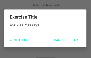
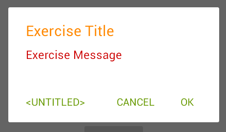
Android Studio 를 열고, 새로운 프로젝트 템플릿으로 간단한 안드로이드 앱 프로젝트를 만든 뒤, 아래와 같은 코드를 MainActivity 에 추가합니다. 그리고, 앱을 실행하면, 그림과 같은 화면이 보여질 것입니다. (다이얼로그의 스트링은 Android Resource 를 사용했습니다. string.xml 파일에 추가하기가 매우 귀찮아서요. --;)


    fun showDialog(){
        AlertDialog.Builder(this)
            .setTitle("Exercise Title")
            .setMessage("Exercise Message")
            .setPositiveButton(android.R.string.yes, null)
            .setNegativeButton(android.R.string.no, null)
            .setNeutralButton(android.R.string.untitled, null)
            .show()        
    }


원문 : Note: Attribute names from the support library do not use the android: prefix. That's used only for attributes from the Android framework.


템플릿에서 생성해주는 코드에는 application theme 로 AppTheme 를 activity theme 로는 AppTheme.NoActionBar 를 자동으로 설정해줍니다.


<!-- AndroidManifest.xml -->
    <application
	...
        android:theme="@style/AppTheme">
        <activity
            android:name=".MainActivity"
            android:label="Main"
            android:theme="@style/AppTheme.NoActionBar">
            <intent-filter>
                <action android:name="android.intent.action.MAIN" />
                <category android:name="android.intent.category.LAUNCHER" />
            </intent-filter>
        </activity>
        <activity android:name=".NextActivity" android:label="Next"/>
    </application>
<!-- src/main/res/values/style.xml -->
    <style name="AppTheme" parent="Theme.AppCompat.Light.DarkActionBar">
        <!-- Customize your theme here. -->
        <item name="colorPrimary">@color/colorPrimary</item>
        <item name="colorPrimaryDark">@color/colorPrimaryDark</item>
        <item name="colorAccent">@color/colorAccent</item>
    </style>

    <style name="AppTheme.NoActionBar">
        <item name="windowActionBar">false</item>
        <item name="windowNoTitle">true</item>    
    </style>
    
<!-- src/main/res/values/color.xml -->    
    <color name="colorPrimary">#6200EE</color>
    <color name="colorPrimaryDark">#3700B3</color>
    <color name="colorAccent">#03DAC5</color>    


기본으로 생성해주는 코드를 실행했을 때의 AlertDialog 의 모습은 아래와 같습니다. OK, Cancel 버튼의 색깔이 AppTheme 에서 설정한 colorAccent 의 값(#03DAC5)입니다.


Android AlertDialog 실행 화면


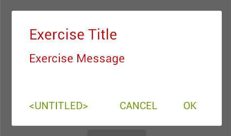
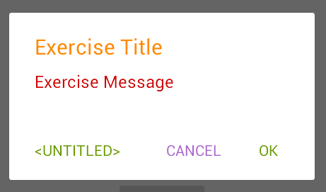
간단하게 버튼의 색깔을 바꾸는 것은 colorAccent 값을 바꿔 주는 것만으로도 가능합니다. 이를 테면, 아래 코드처럼 activity theme 인 AppTheme.NoActionBar 에 colorAccent 아이템을 추가해주는 것 만으로도 쉽게 변경할 수 있습니다.

<!-- src/main/res/values/style.xml -->
    <style name="AppTheme.NoActionBar">
		...
        <item name="colorAccent">@android:color/holo_green_dark</item>
    </style> 


하지만, 이런 식으로 변경하면, 그림 우 하단의 편지 모양의 색깔도 같이 바뀌어 버립니다.

만약, 이런 색상 변경이 의도된 것이라면 상관없지만, alertDialog 의 색상만 바꾸고자한다면, alertDialogTheme 스타일을 만들어서 별도로 설정해야 합니다.

    <style name="AppTheme.NoActionBar">
        <!--        <item name="colorAccent">@android:color/holo_green_dark</item>-->
        <item name="alertDialogTheme">@style/AppTheme.AlertDialogTheme</item>
    </style>

    <style name="AppTheme.AlertDialogTheme" parent="ThemeOverlay.AppCompat.Dialog.Alert">
        <item name="colorAccent">@android:color/holo_green_dark</item>
    </style>


다이얼로그 테마에 android:textColorPrimary 아이템을 추가해주면, 다이얼로그 타이틀의 색상을 변경할 수 있습니다.

    <style name="AppTheme.AlertDialogTheme" parent="ThemeOverlay.AppCompat.Dialog.Alert">
        <item name="colorAccent">@android:color/holo_green_dark</item>
        <item name="android:textColorPrimary">@android:color/holo_red_dark</item>
    </style>


음... 메시지 색상까지 같이 변경되었습니다. --; 타이틀과 메시지를 각각 다른 색으로 지정하려면, 역시 스타일을 지정해주어야 합니다. 타이틀 스타일은 android:windowTitleStyle 을 사용합니다.

    <style name="AppTheme.AlertDialogTheme" parent="ThemeOverlay.AppCompat.Dialog.Alert">
        <item name="colorAccent">@android:color/holo_green_dark</item>
        <item name="android:textColorPrimary">@android:color/holo_red_dark</item>
        <item name="android:windowTitleStyle">@style/AppTheme.AlertDialogTheme.WindowTitle</item>
    </style>

    <style name="AppTheme.AlertDialogTheme.WindowTitle" parent="RtlOverlay.DialogWindowTitle.AppCompat">
        <item name="android:textColor">@android:color/holo_orange_dark</item>
    </style>


마지막으로 Cancel 만 한 번 바꾸어 보도록 하겠습니다. buttonBarButtonStyle 을 추가하면 되는데, 그러면, 모두 바뀌어 버리니, buttonBarNegativeButtonStyle 스타일만 하나 추가해 봅니다.

    <style name="AppTheme.AlertDialogTheme" parent="ThemeOverlay.AppCompat.Dialog.Alert">
        <item name="colorAccent">@android:color/holo_green_dark</item>
        ...
        <!--        <item name="buttonBarButtonStyle">@style/AppTheme.AlertDialogTheme.Button</item>-->
        <!--        <item name="buttonBarPositiveButtonStyle">@style/AppTheme.AlertDialogTheme.Button</item>-->
        <item name="buttonBarNegativeButtonStyle">@style/AppTheme.AlertDialogTheme.Button</item>
        <!--        <item name="buttonBarNeutralButtonStyle">@style/AppTheme.AlertDialogTheme.Button</item>-->
    </style>

    <style name="AppTheme.AlertDialogTheme.Button" parent="Widget.AppCompat.Button.ButtonBar.AlertDialog">
        <item name="android:textColor">@android:color/holo_purple</item>
    </style>


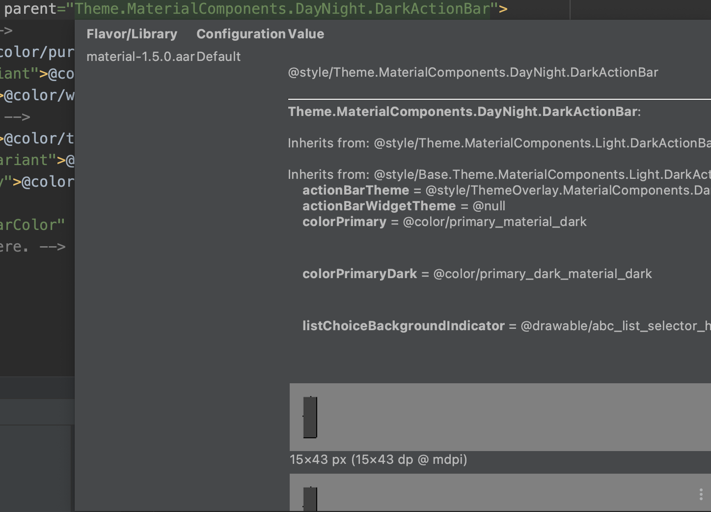
위에서 말한 모든 값들의 참조가 될 수 있는 것들의 힌트는 appcompat-1.1.0/res/values/values.xml 에 모두 있습니다. 알고보면, abc_alert_dialog_material.xml 레이아웃의 DialogTitle 과 message TextView 의 textColor 는 동일하게 ?android:textColorPrimary 로 설정되어 있다는 것도 확인할 수 있습니다.

<!-- appcompat-1.1.0/res/values/values.xml -->
<style name="Theme.AppCompat.Light.DarkActionBar" parent="Base.Theme.AppCompat.Light.DarkActionBar"/>

<style name="Base.Theme.AppCompat.Light.DarkActionBar" parent="Base.Theme.AppCompat.Light">

<style name="Base.Theme.AppCompat.Light" parent="Base.V7.Theme.AppCompat.Light">

<style name="Base.V7.Theme.AppCompat.Light" parent="Platform.AppCompat.Light">
	...
        <item name="alertDialogTheme">@style/ThemeOverlay.AppCompat.Dialog.Alert</item>
        <item name="alertDialogStyle">@style/AlertDialog.AppCompat.Light</item>
        <item name="alertDialogCenterButtons">false</item>
        <item name="textColorAlertDialogListItem">@color/abc_primary_text_material_light</item>
        <item name="listDividerAlertDialog">@null</item>
	...
</style>

<style name="AlertDialog.AppCompat.Light" parent="Base.AlertDialog.AppCompat.Light"/>

<style name="Base.AlertDialog.AppCompat.Light" parent="Base.AlertDialog.AppCompat"/>

<style name="Base.AlertDialog.AppCompat" parent="android:Widget">
  <item name="android:layout">@layout/abc_alert_dialog_material</item>
  <item name="listLayout">@layout/abc_select_dialog_material</item>
  <item name="listItemLayout">@layout/select_dialog_item_material</item>
  <item name="multiChoiceItemLayout">@layout/select_dialog_multichoice_material</item>
  <item name="singleChoiceItemLayout">@layout/select_dialog_singlechoice_material</item>
  <item name="buttonIconDimen">@dimen/abc_alert_dialog_button_dimen</item>
</style>


덧붙임.


Android Studio 에서 theme.xml 파일에서 마우스 오버만 해도 관련된 정보들을 상당수 확인할 수 있습니다.


안드로이드 스튜디오에서 parent 속성에 마우스 오버했을 때 나오는 정보 : 속성값이 어떤 style 로 부터 상속된 것인지 상세하게 보여줍니다.


Android

Android Custom Lint

2020. 7. 28. 15:42


이 글은 "AndroIdiots Podcast E18: Custom Lints with Hitanshu Dhawan"(https://medium.com/androidiots/androidiots-podcast-e18-custom-lints-349f0651d458) 을 읽고 그대로 따라해 보면서 몇 가지 보충설명을 담아보았습니다. 이 글의 내용은 이 팀에서 UI 정책 같은 것들 때문에 RadioButton 을 Customize 한 IdiotRadioButton 사용하는데, 만약, RadioButton 을 그대로 사용할 경우, 경고 메시지를 주고, IdiotRadioButton 으로 수정/테스트하는 과정을 담은 것입니다.


Lint(린트) : 린트는 소스 코드를 분석하여 프로그래밍 오류, 버그, 문체 오류 및 의심스러운 구성을 표시하는 도구입니다.


Step 1. Java/Kotlin 라이브러리 모듈 생성


Step 2. Dependency 추가

:LintLibraryModule/build.gradle

dependencies {
    def lintVersion = '26.5.3'
    // Lint
    compileOnly "com.android.tools.lint:lint-api:$lintVersion"
    compileOnly "com.android.tools.lint:lint-checks:$lintVersion"
}

:app/build.gradle

dependencies {
	lintChecks project(path: ':LintLibraryModule')
}


Step 3. IssueRegistry 생성

CustomCodeIssueDetector.ISSUE 는 Step 6 에서 만듭니다.

class CustomIssueRegistry : IssueRegistry() {
    override val issues: List<Issue>
        get() = listOf(
            CustomCodeIssueDetector.ISSUE
        )
}


Step 4. IssueRegistry 선언

안드로이드 스튜디오에서도 아래 그림과 같이 경고 팝업으로 알려주게 하려면 (1) gradle 코드를 추가하거나, (2) resources 에 텍스트 파일을 추가해 주어야 합니다.


1. gradle 에 추가하는 방법 : package name = com.example 일 경우,

dependencies {
    def lintVersion = '26.5.3'
    compileOnly "com.android.tools.lint:lint-api:$lintVersion"
    ...
}

jar {
    manifest {
        attributes("Lint-Registry-v2": "com.example.CustomIssueRegistry")
    }
}

2. Resource File 추가 하는 방법 : package name = com.example 일 경우,


Step 5. Custom Detector 클래스 만들기

class CustomCodeIssueDetector : Detector()


Step 6. Custom Detector Issue 만들기

Issue 를 생성할 때 필요한 값들에 대한 설명은 굳이 하지 않아도 대략 알 수 있도록 네이밍되어 있어 생략합니다. ^^

class CustomCodeIssueDetector : Detector() {
    companion object {
        val ISSUE = Issue.create(
            id = "IdiotRadioButtonUsageWarning",
            briefDescription = "Android's RadioButton should not be used",
            explanation = "Don't use Android Radio button, be an idiot and use IdiotRadioButton instead",
            category = Category.CORRECTNESS,
            priority = 3,
            severity = Severity.WARNING,
            implementation = Implementation(
                CustomCodeIssueDetector::class.java,
                Scope.RESOURCE_FILE_SCOPE
            )
        )
    }
}


Step 7.  Scanner 추가하기

class CustomCodeIssueDetector : Detector(), XmlScanner {
    override fun getApplicableElements(): Collection<String> {
        return listOf(
            "RadioButton"
        ) // will look for Radio Button //Text in all xml
    }

    override fun visitElement(context: XmlContext, element: Element) {
        context.report(
            issue = ISSUE,
            location = context.getNameLocation(element),
            message = "Usage of RadioButton is prohibited" // Error message
        )
    }

    companion object {
        val ISSUE = Issue.create(...) // Step 6 참고
    }
}


Step 8. Lint (Quick) Fix 추가


class CustomCodeIssueDetector : Detector(), XmlScanner {
    override fun getApplicableElements(): Collection<String> { ... } // Step 7 참고

    override fun visitElement(context: XmlContext, element: Element) {
        val idiotRadioButtonFix = LintFix.create()
            .name("Use IdiotRadioButton")
            .replace()
            .text("RadioButton")
            .with("com.androidiots.playground.IdiotRadioButton")
            .robot(true)
            .independent(true)
            .build()

        context.report(...) // Step 7 참고
    }

    companion object {
        val ISSUE = Issue.create(...) // Step 6 참고
    }
}


여기까지가 "AndroIdiots Podcast E18: Custom Lints with Hitanshu Dhawan"(https://medium.com/androidiots/androidiots-podcast-e18-custom-lints-349f0651d458) 에서 RadioButton 을 추가할 경우, Lint 를 이용해 경고메시지를 주고, RadioButton IdiotRadioButton 으로 Quick Fix 하는 코드입니다.


테스트 코드 작성

1. 테스트를 위한 dependency 추가

:LintLibraryModule/build.gradle

dependencies {
    def lintVersion = '26.5.3'
    ...

    testImplementation "com.android.tools.lint:lint:$lintVersion"
    testImplementation "com.android.tools.lint:lint-tests:$lintVersion"
    testImplementation "junit:junit:4.12"
}

2. 테스트 코드 작성

:LintLibraryModule/src/test/

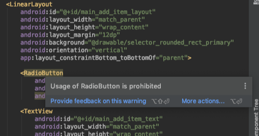
layout.xml 에서 RadioButton 을 사용하면 Warning 을 표시하는지 확인할 수 있는 코드

class CustomCodeIssueDetectorTest {
    val testInputString = """
            <LinearLayout xmlns:android="http://schemas.android.com/apk/res/android">
                <RadioButton android:id="@+id/someidlowercase" />
            </LinearLayout>
              """
    @Test
    fun testRadioButton() {
        lint().files(
            xml(
                "res/layout/layout.xml", testInputString
            ).indented())
            .issues(CustomCodeIssueDetector.ISSUE)
            .allowMissingSdk(true)
            .run()
            .expectWarningCount(1)
    }
}


Lint 관련된 여러 글들을 보면, 안드로이드 그 자체의 Lint 기능이 강력해서 이딴 기능을 굳이 쓸필요가 있느냐하는 식의 멘트들이 많이 있습니다. 이 글의 사례, RadioButton -> IdiotRadioButton 으로 사용하는 것도 그닷 좋은 방법은 아니라 ,예제만 보아도 실제 이런 Lint 가 필요하다고 보기에는 조금 설득력이 떨어집니다. 개발에 참여하는 인원이 적을 수록 별로 의미가 없는 작업이지만, 안드로이드 앱 하나에 4~50명의 개발자가 동시에 개발할 경우, 코드 컨벤션처럼 강력하게 정착시켜야 할 것은 아니지만, 개발자들의 성향(?)에 따라 느슨한 룰같은 것들이 생기기 때문에, 큰 조직이라면 어쩌면 필요할 수도 있겠다는 생각이 듭니다. "Writing a Custom Android UI Inheritance Lint Rule"(https://medium.com/@roderiklagerweij/writing-a-custom-android-ui-inheritance-lint-rule-9af254480399) 에서 나온 것들이 아마도 대표적인 사례(i.e. IncorrectViewId)가 아닐까 싶습니다. 조금 익숙해지신 분들이라면, 글보다는 github(https://github.com/roderiklagerweij/AndroidCustomLint) 코드를 보시는 것이 훨씬 빠를 것입니다.


2020/03/09 - [Android/Widget] - 안드로이드 위젯 개발하기 (1)

2020/03/10 - [Android/Widget] - 안드로이드 위젯 개발하기 (2)

2020/03/13 - [Android/Widget] - 안드로이드 위젯 개발하기 (3)


누군가가 내가 만든 앱에 View 를 만들고 제멋대로 동작하게 만들어 놓았다고 생각해본다면, 매우 짜증나는 일일 것입니다.

위젯이란 것도 결국 내가 남의 앱위에 View 를 만들고 동작하도록 만드는 것이기 때문에, 위젯을 만들어 사용하는데는 매우 제한적인 방법을 사용해야 합니다.


단순히 TextView 의 Text 를 수정하는 것도 아래와 같이 별도의 API 를 사용해야 합니다.

        val remoteViews = RemoteViews(
            "com.tistory.develop_branch.widget",
            R.layout.widget_layout
        )
        remoteViews.setTextViewText(R.id.widget_text, "setTextViewText")


안드로이드 위젯의 경우, 사용할 수 있는 View 의 종류도 정해져 있습니다.

처음 위젯을 개발할 때, 가장 쉽게 부딪히는 오류가 이런 View 를 사용하지 않아서 입니다. 상속한 View 조차 사용하면 안됩니다.

위젯에서 사용할 수 있는 View 의 종류는 여기를 확인하세요.


이런 제약사항들은 RemoteView 에 대한 문서를 읽어보면, 좀 더 자세히 알 수 있습니다.


이 제약사항들 중 아마도 가장 중요한 것은 setOnClickPendingIntent 일 것입니다.

여기서 PendingIntent 에 대한 개발자 문서도 한 번 읽어보고 넘어가는 것이 좋습니다.


A PendingIntent itself is simply a reference to a token maintained by the system describing the original data used to retrieve it. This means that, even if its owning application's process is killed, the PendingIntent itself will remain usable from other processes that have been given it. If the creating application later re-retrieves the same kind of PendingIntent (same operation, same Intent action, data, categories, and components, and same flags), it will receive a PendingIntent representing the same token if that is still valid, and can thus call cancel() to remove it.


PendingIntent 는 시스템에 의해 유지되는 레퍼런스 토큰이라는 말이 나옵니다.

같은 intent action, data, category, component, flag 를 가지고 있다면 같은 PendingIntent 를 사용하게 된다는 의미로, PendingIntent를 생성할 때 사용하는 Intent 에 다른 Extra 값을 지정한다고 해서 다른 PendingIntent 가 생성되지는 않습니다.

그래서, widget Click 시 다른 동작을 지정하고자 할 때는 Extra 값이 아닌, Action 혹은 Data 를 변경해야 합니다.

이를 테면, 보통 A 라는 Activity 를 실행하기 위해 putExtra("extra",1), putExtra("extra",2) 로 구분해서 사용했다고 해서, PendingIntent 에 동일하게 적용하면 낭패를 보기 쉽습니다.

만약, PendingIntent 적용하고자 한다면, extra 값이 아닌, action = "com.tistory.develop_branch.widget.1", action = "com.tistory.develop_branch.widget.2" 와 같이 action 을 변경해서 사용해야 합니다.


2020/03/09 - [Android/Widget] - 안드로이드 위젯 개발하기 (1)

2020/03/10 - [Android/Widget] - 안드로이드 위젯 개발하기 (2)

2020/03/13 - [Android/Widget] - 안드로이드 위젯 개발하기 (3)

'Android Widget' 카테고리의 다른 글

안드로이드 위젯 개발하기 (3)  (0) 2020.03.13
안드로이드 위젯 개발하기 (2)  (0) 2020.03.10
안드로이드 위젯 개발하기 (1)  (0) 2020.03.09